Mimo
Founder: Caitlin O’Grady
Website: mimoweddings.com
Socials: @mimo.weddings
Mimo, affectionately nicknamed after the lively mimosa captures the warmth, playfulness, and effortless elegance of contemporary weddings.
-
What began as a natural extension of creative expression has evolved into a brand that feels joyful, refined, and full of personality.
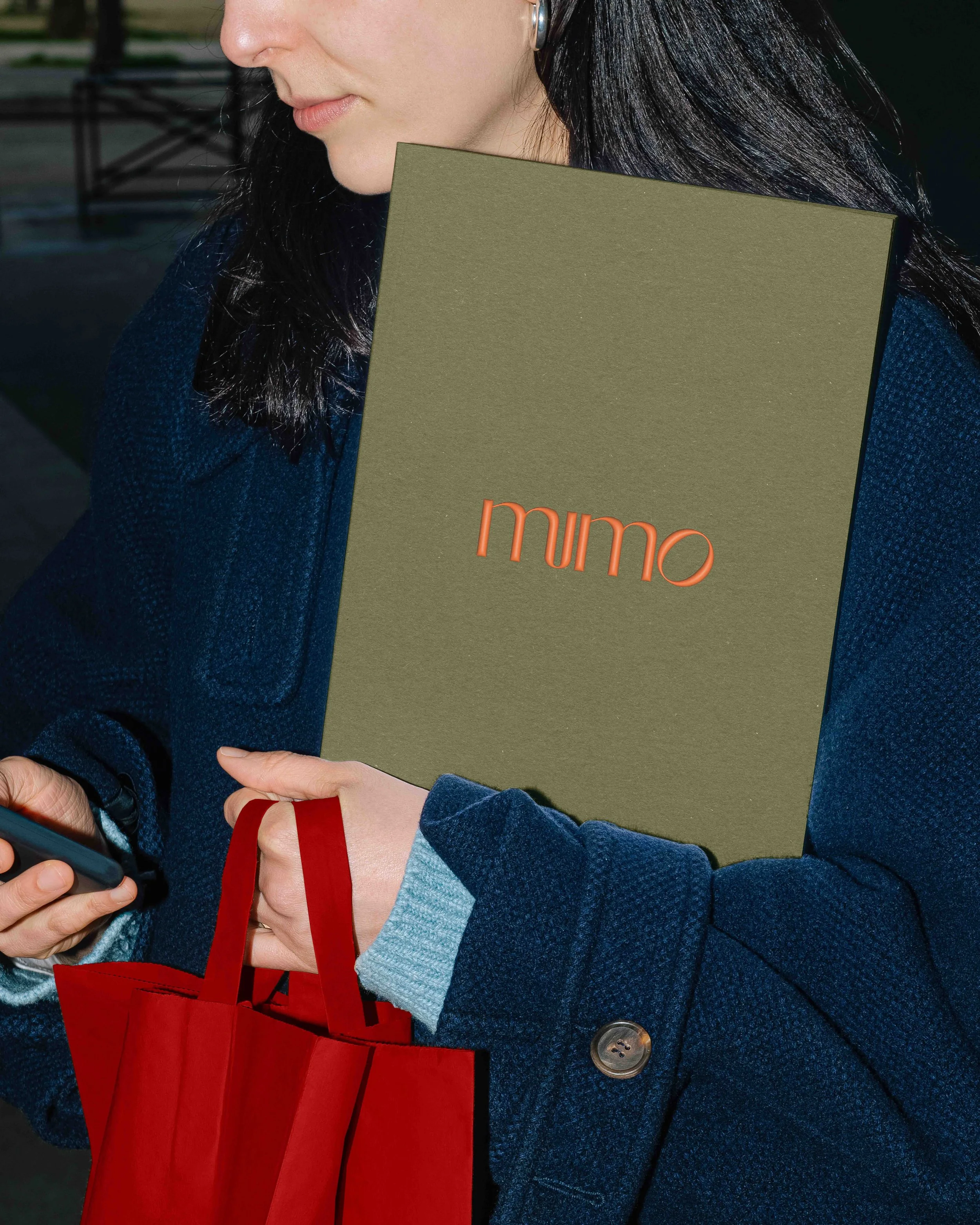
When creating Mimo’s brand identity, we set out to reflect the spirit their work champions: vibrant yet sophisticated, spontaneous yet intentional. The use of orange as the primary colour pays homage to the brand’s namesake while bringing a sense of optimism and vitality to every touchpoint.
Paired with a minimal logotype, the system feels confident and refined, its presence elevated through print applications. The stationery suite, printed on Stephen Verdigris Green 360gsm stock, balances boldness with tactility, a material expression of modern romance itself.
The result is an identity that feels timeless yet full of life. Mimo is a celebration of connection, creativity, and joy, a brand that makes every moment feel like a toast worth raising.