PROOF BAKEHOUSE
Founder: Matilda Chambers
Website: proofbakehouse.com.au
Socials: @proofbakehouse
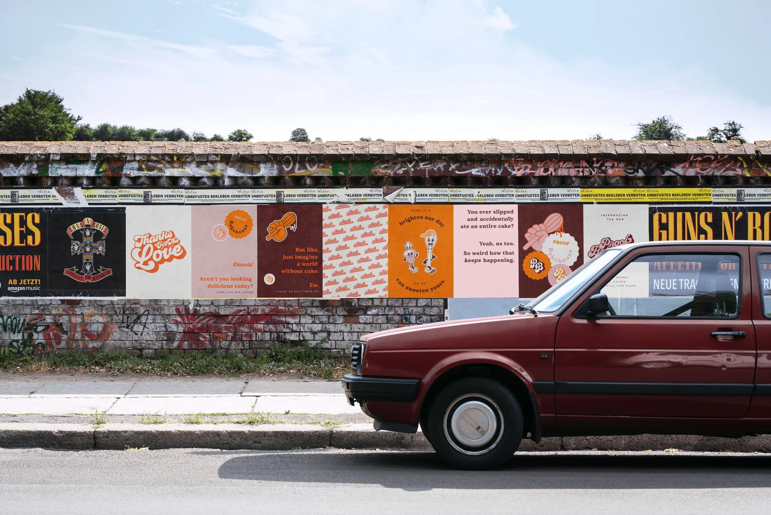
Proof Bakehouse is a cake shop with a strong sense of place. A bright orange facade on a Carlton corner, framed by complementary pale pink. It is the kind of spot you notice from the end of the street and remember.
-
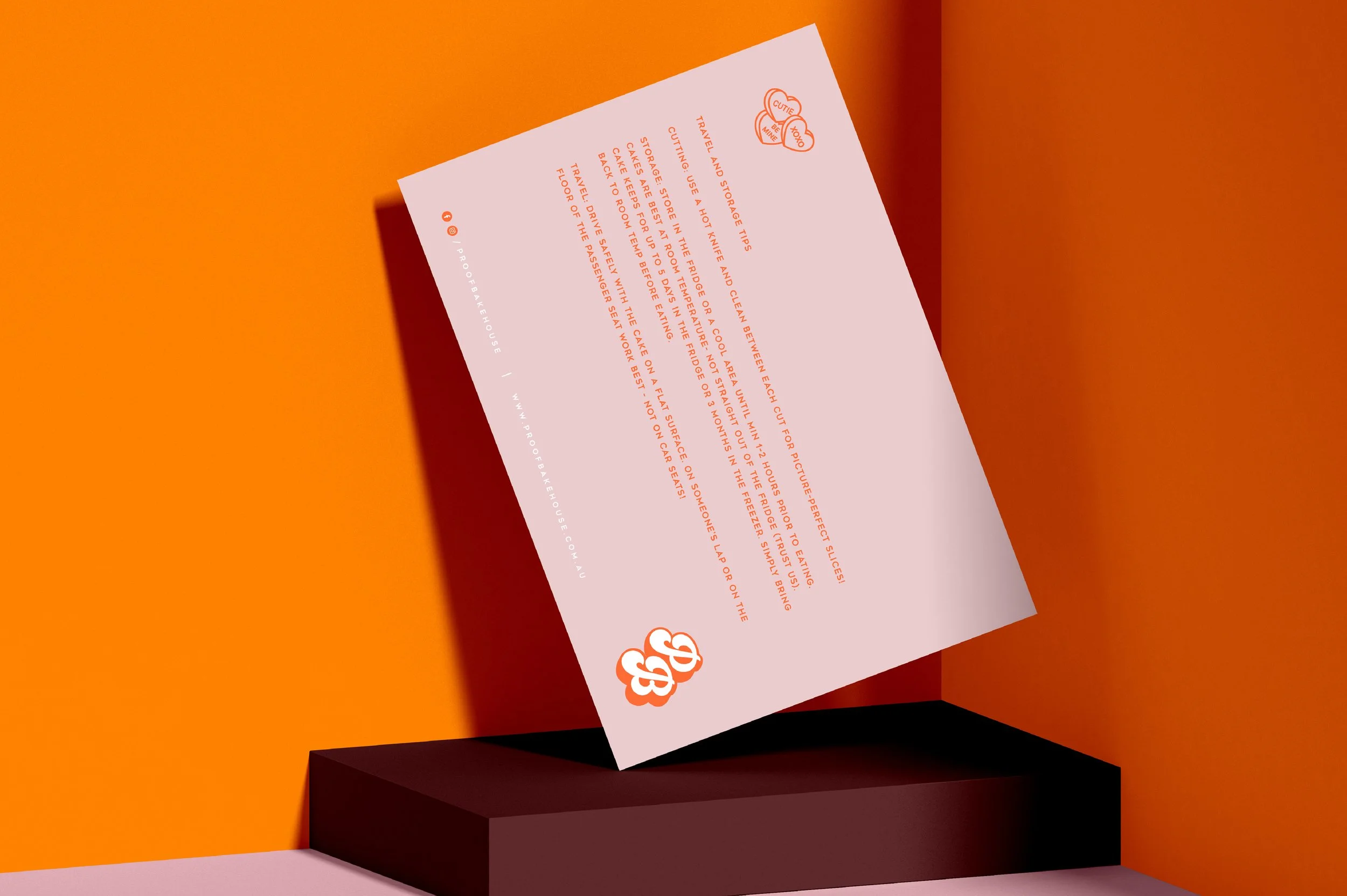
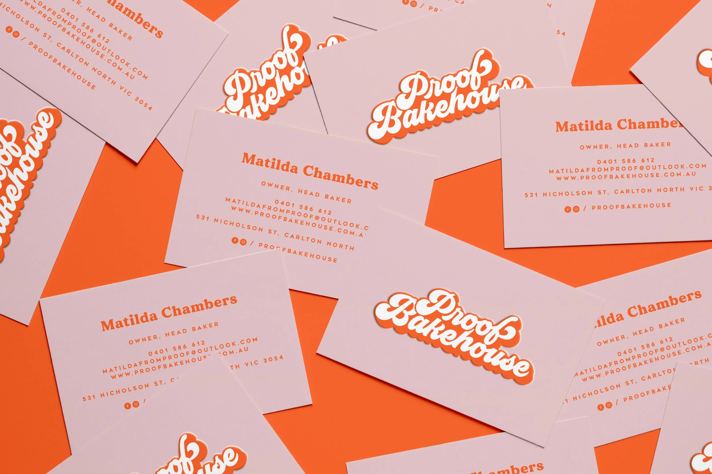
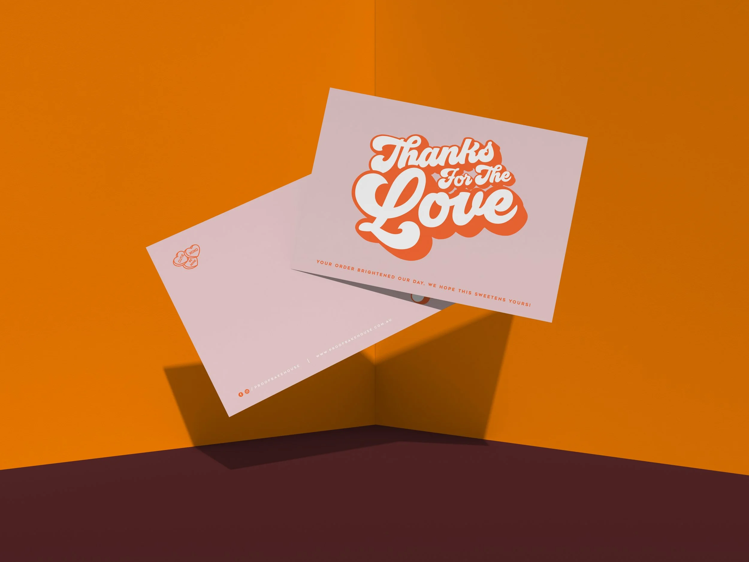
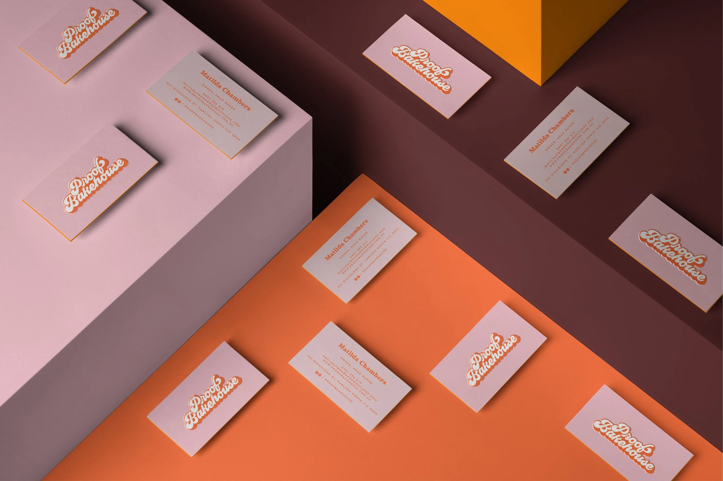
We created a visual identity that leaned into that confidence and colour. The logo is built from a layered seventies-inspired typeface, stacked and a little chunky, so it feels playful and nostalgic while still reading clearly at a glance. It is designed to hold its own on a busy street, on a cake box, or on a phone screen.
From there, the orange and pink palette became the anchor across every touchpoint. Collateral, print pieces, food packaging, window signage, comp cards and business cards all carry the same core colours so the brand reads as one family. Stickers, swing tags and cake box labels work as small moments of branding that customers take home, photograph and share.
Typography and layout were kept simple to balance the colour. Clean grids, minimal copy and plenty of breathing room let the logo and palette do the talking. The result feels warm, fun and considered rather than loud for the sake of it.
Proof Bakehouse now shows up as a clear neighbourhood marker. A modern cake studio with a throwback personality, where every layer, from the facade to the packaging, feels intentional.